
Home
No-code tool to design & launch payment experiences for every platform
Payment needs: Through the lens of Business' & Users
Payments are often the final hurdle in any purchase journey. Now, picture yourself as a user - after investing time and effort into finding the right product or service, you abandon the purchase simply because the payment experience feels clunky or untrustworthy. Even worse, imagine this happening to your own business - all your hard work in delivering a great service goes to waste due to a dull, disconnected checkout process that was never your core expertise to begin with. And the reality is, poor experiences tend to linger in people’s minds far longer than positive ones, whether online or offline. A checkout flow that feels disconnected from your brand can quickly drive customers away.
The Hidden Complexity Behind a Simple Need
At first glance, the need seemed simple- businesses wanted a payment experience that seamlessly matched their brand across platforms, displayed the right payment options for their users, and ultimately boosted conversions. The solution appeared obvious: build it for them. Initially, our approach was straightforward - merchants would share their design preferences and desired payment methods, and our developers would take care of the integration. This worked well in the beginning, before we had our no-code customization tool. Tweaking integrations frequently meant - multiple releases, involving high developers effort, longer turnaround time, eventually a pissed off merchant. As the number of merchants grew, it became clear that we needed a faster, more scalable, and simplified way to configure checkout experiences.
Note: When working in the B2B2C model, you've gotta be thinking simultaneously for two types of users - your client (merchants) & their clients (consumers). In short, I was designing a system that our users will use to design for their end users.
A visual teaser for clear product overview
Create a Master Template, Guided Onboarding Tour for first time users to increase their usability and discoverability curve
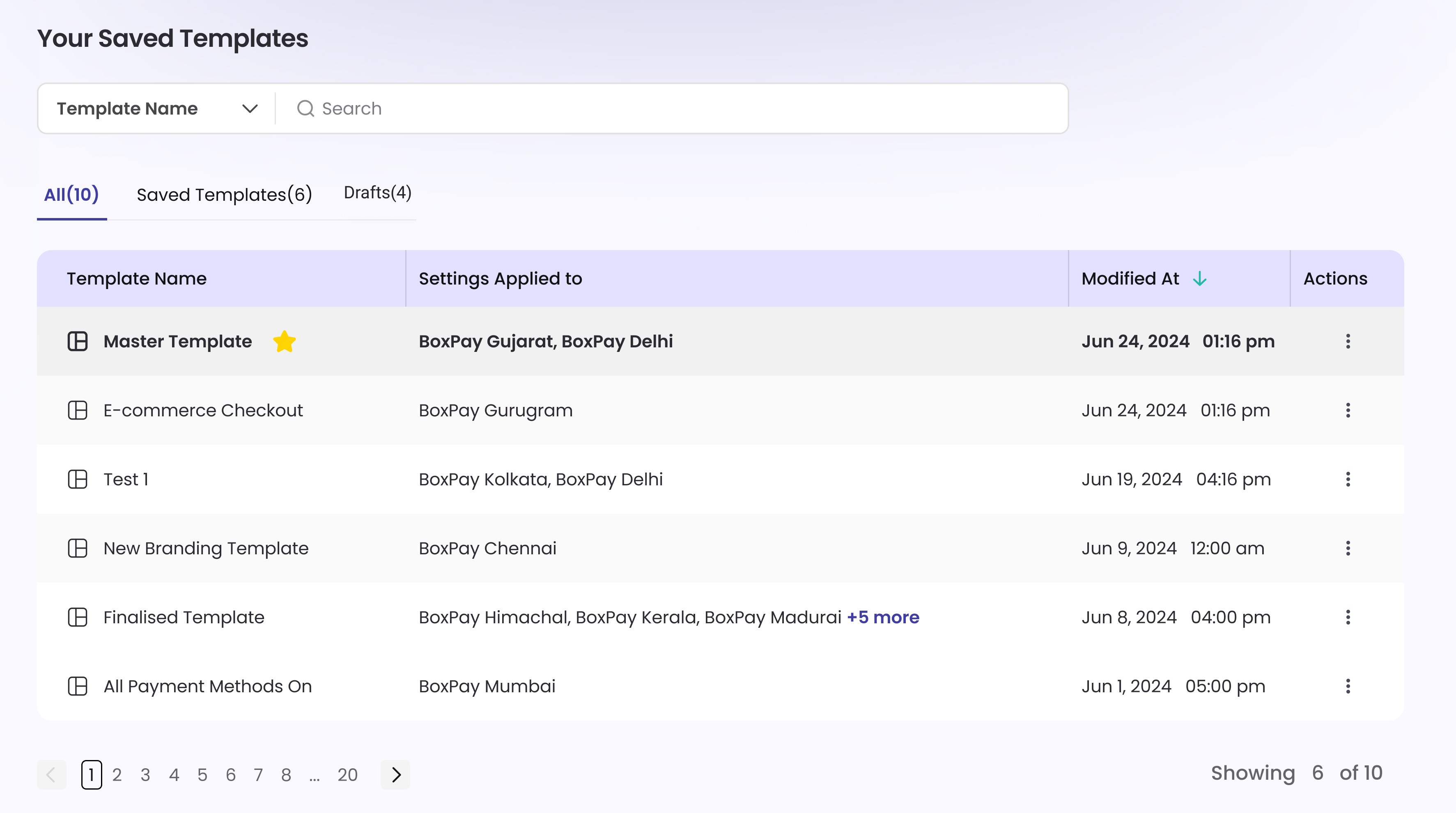
Setting Master Template allows business to modify it’s other Business entities with ease not worrying what will be the fallback settings for its sub-business units if settings are removed or if business wants to reset the checkout settings.
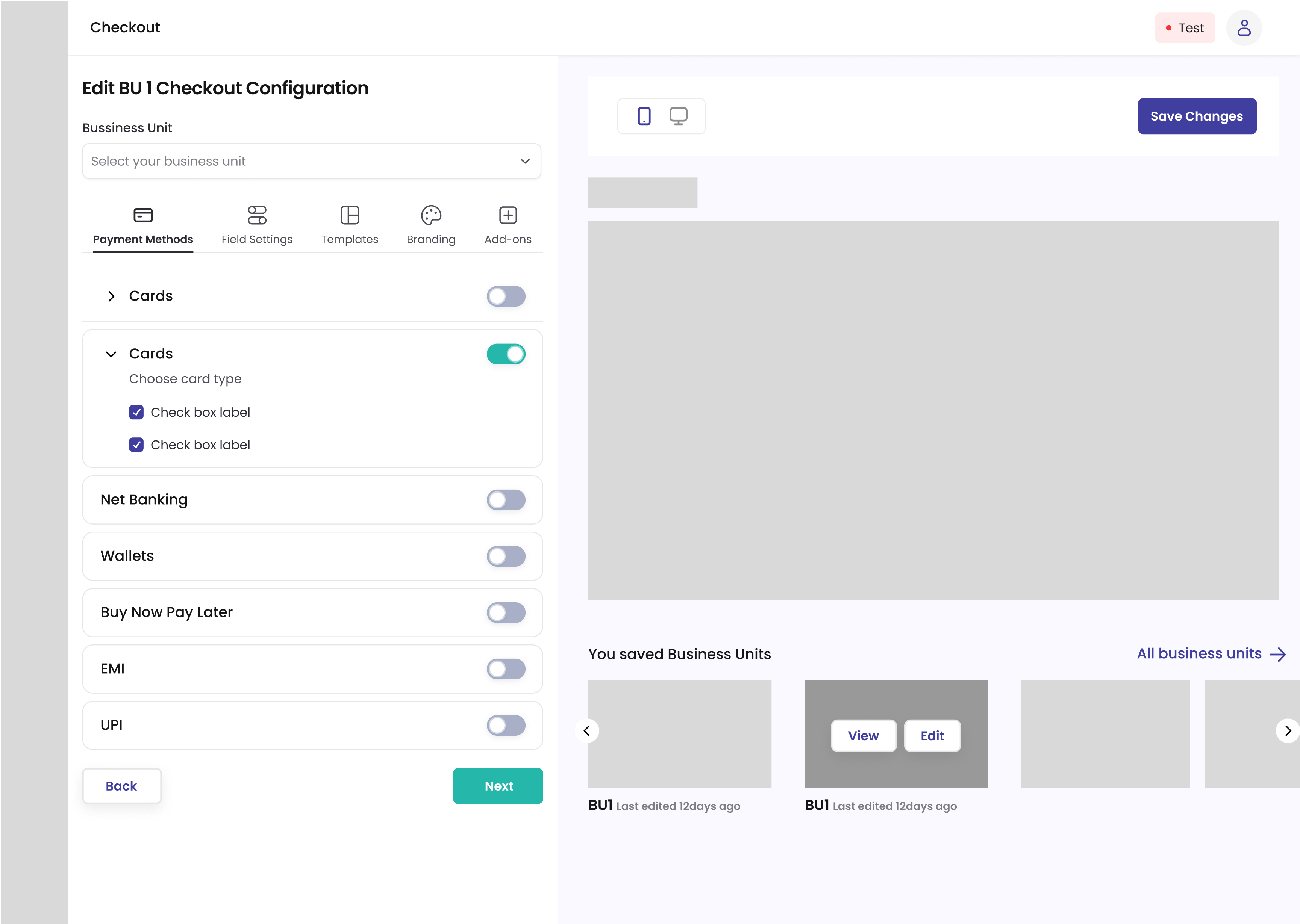
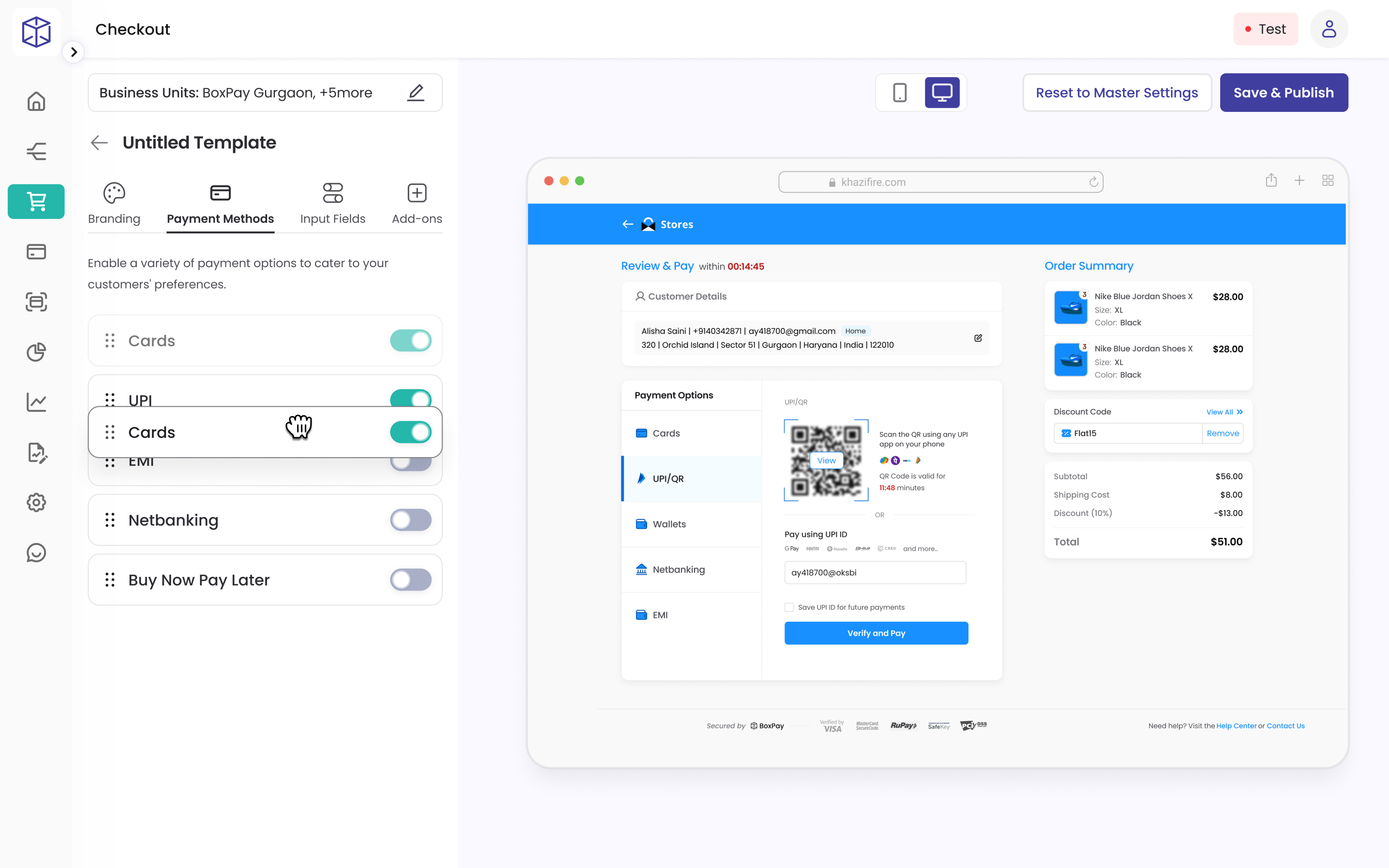
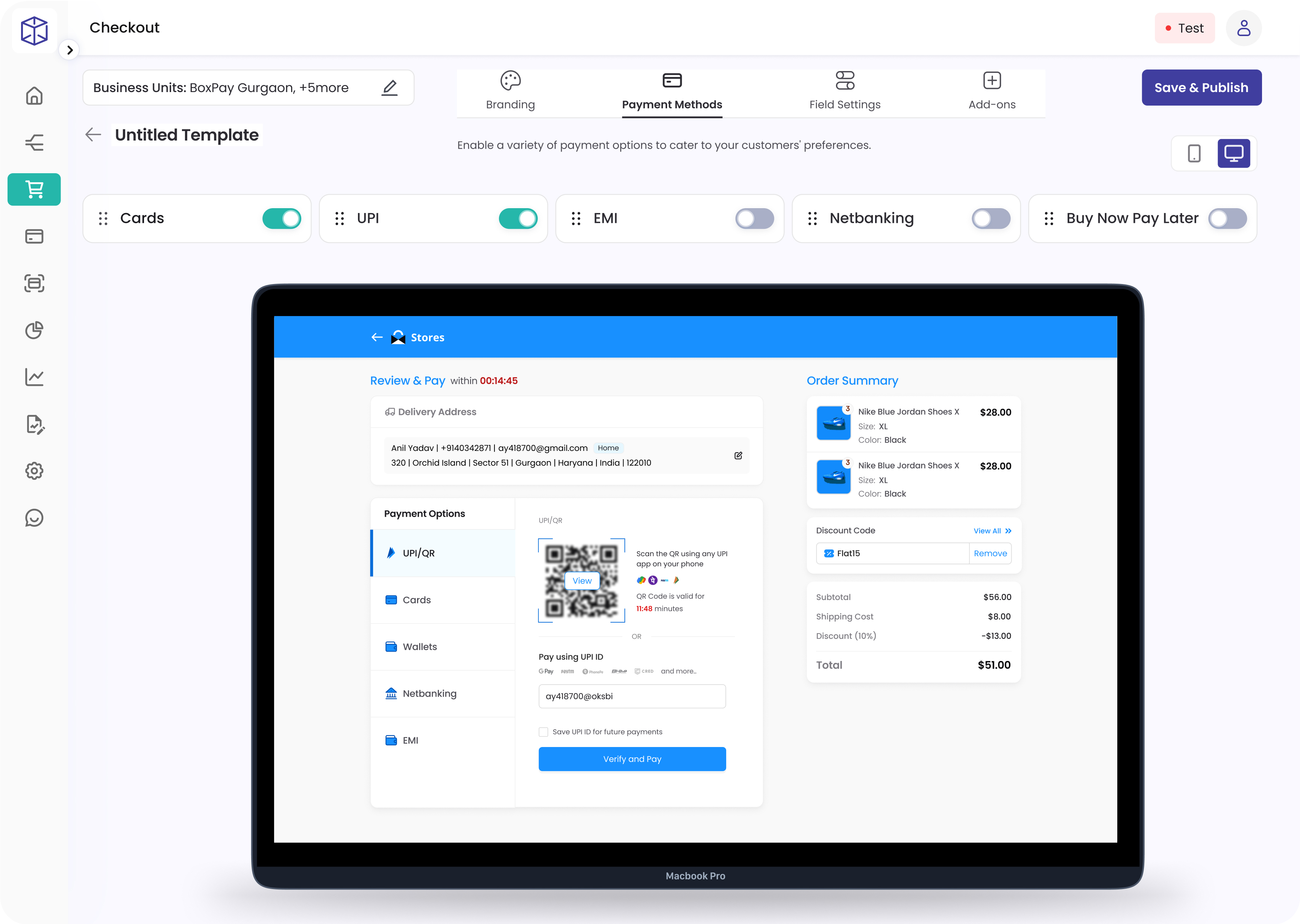
Businesses can define their preferred payment methods and customize the sequence in which they are displayed to users
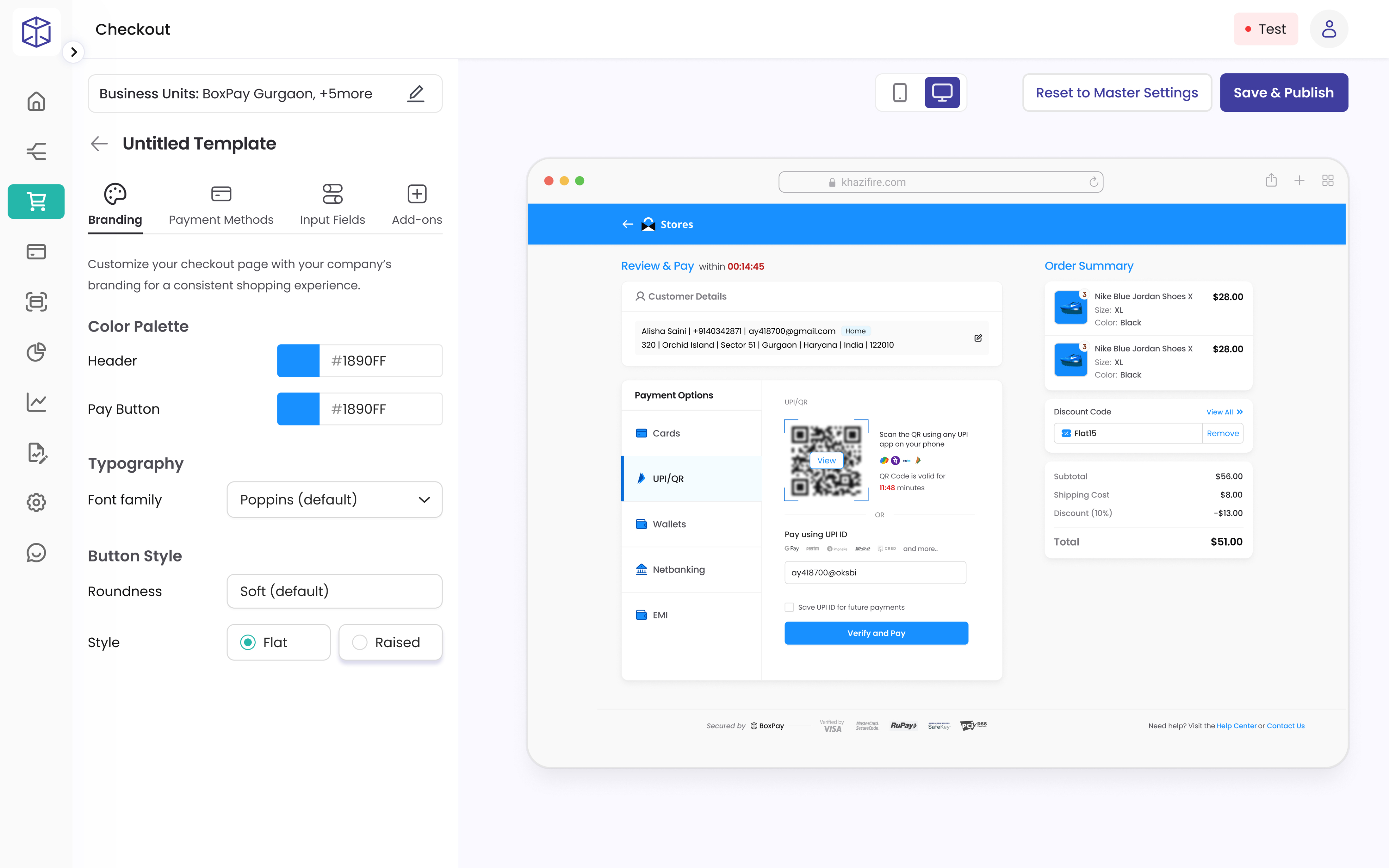
Flexible branding controls let merchants customize colors, buttons, and brand elements for each business unit
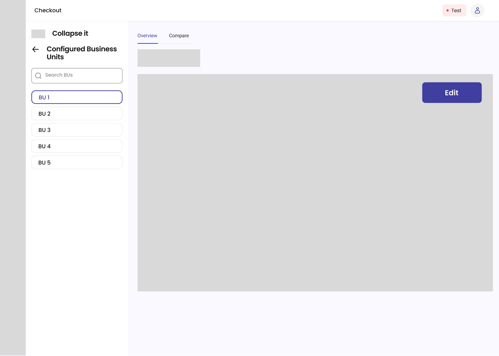
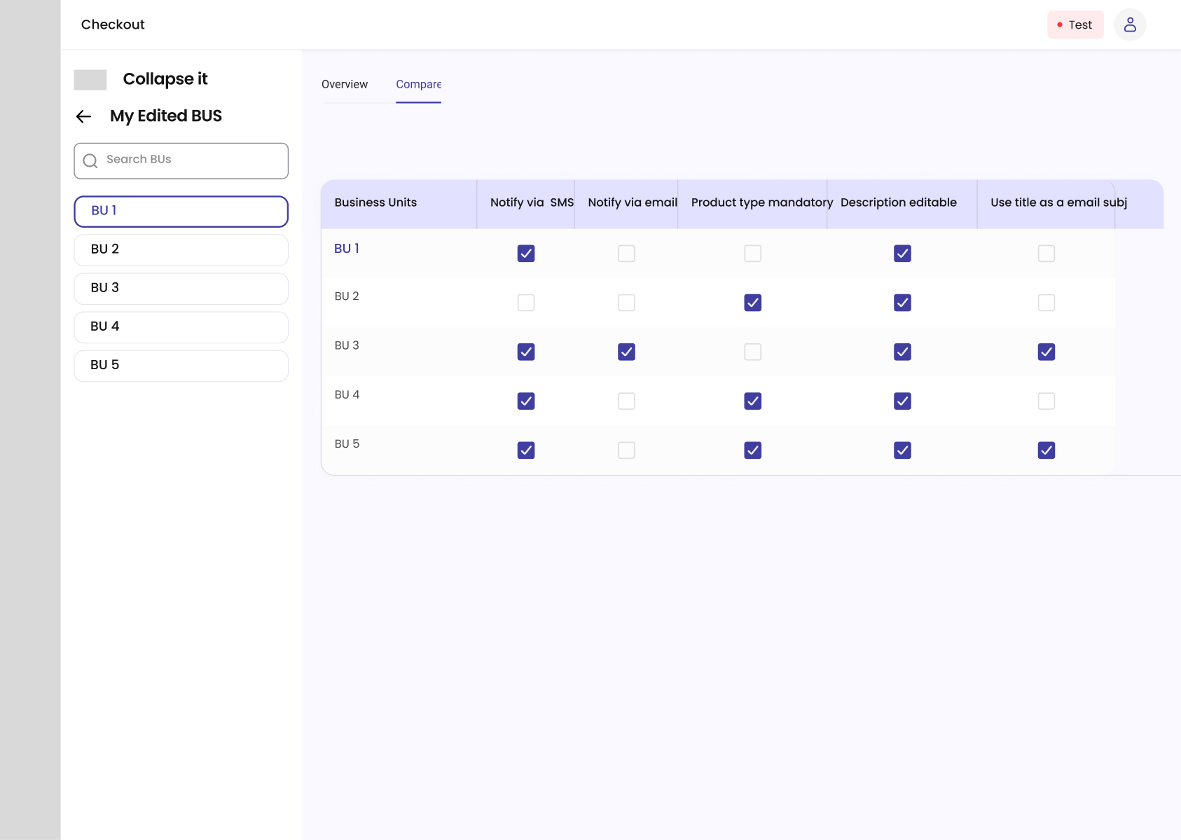
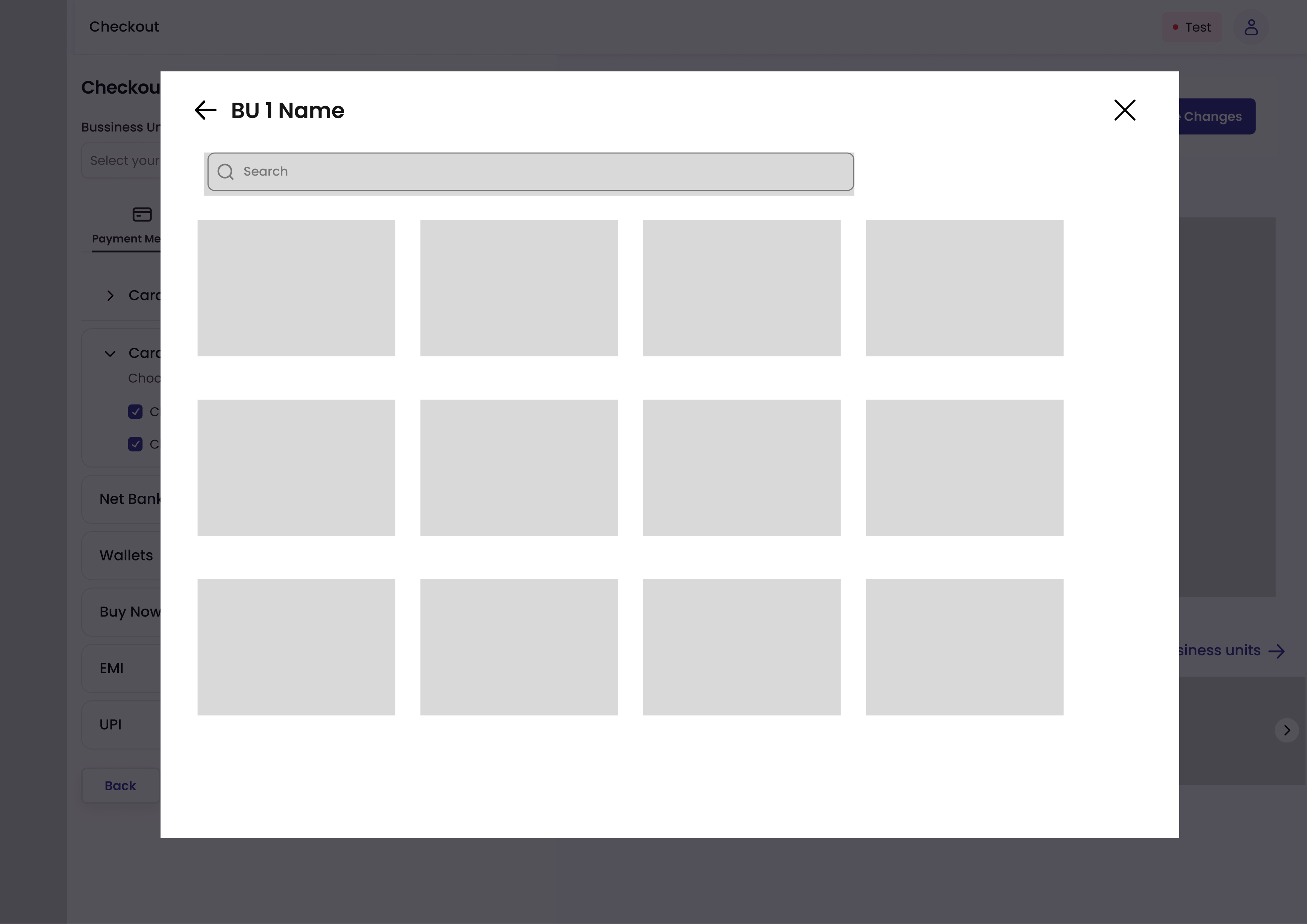
After user has made Master Template, User Can Select Multiple Business Units for which user needs to Make checkout, make edits & access saved templates
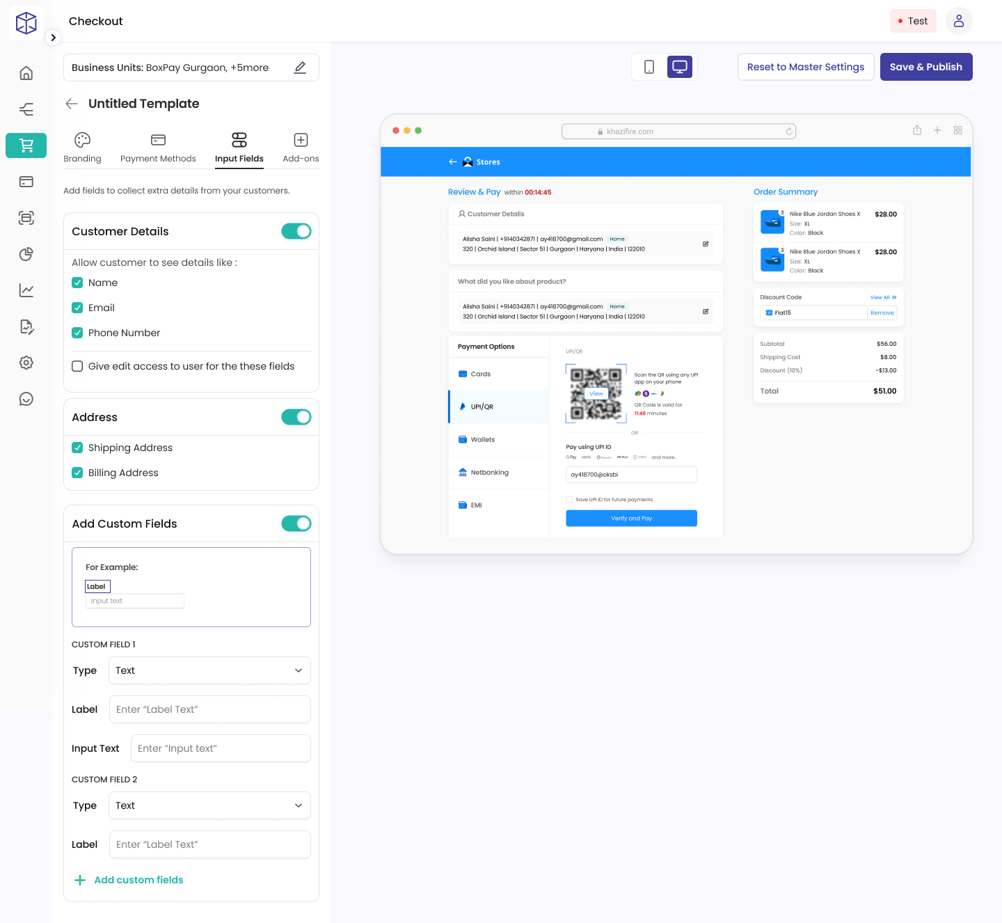
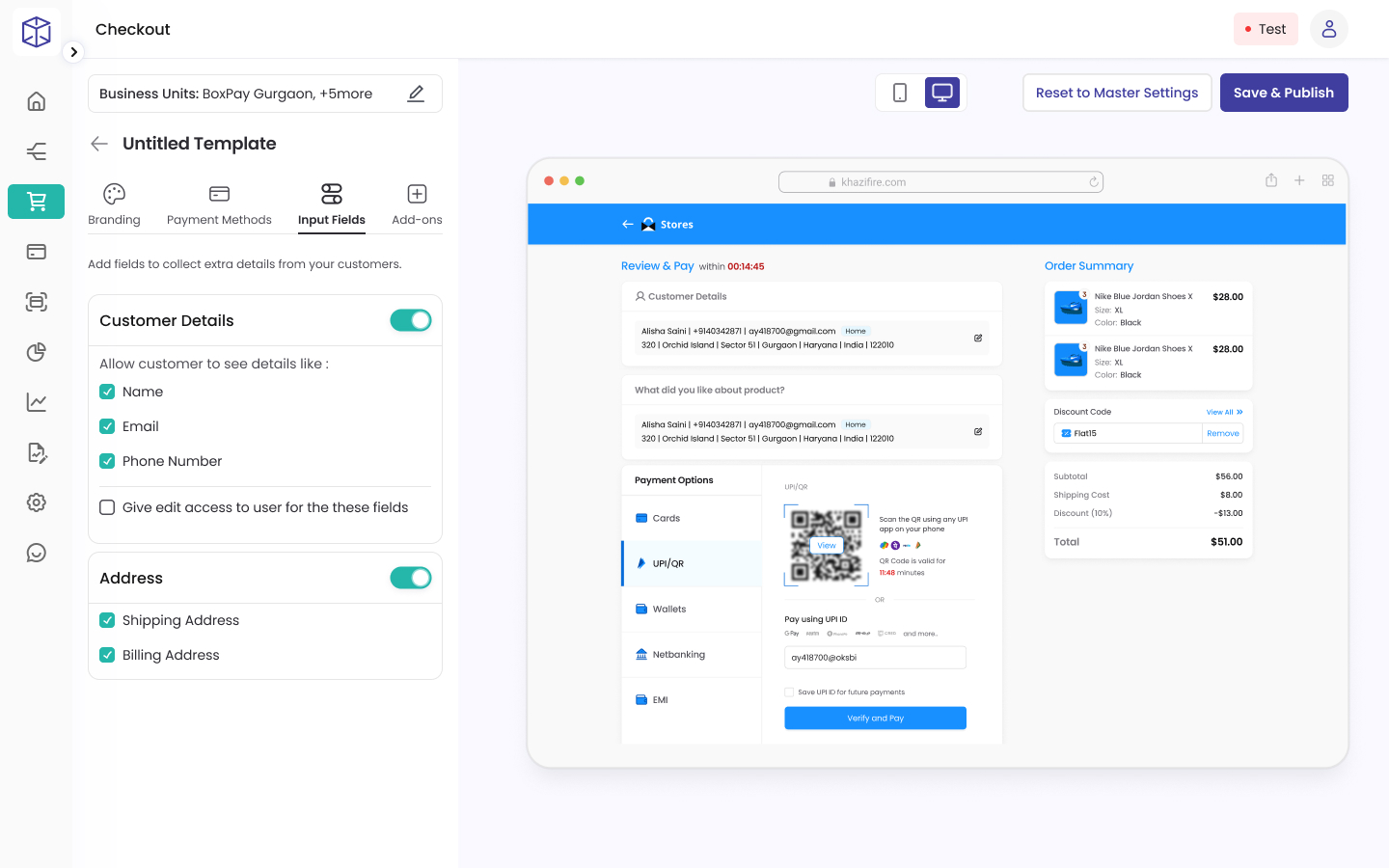
Merchants can toggle between fields, preview designs in both mobile and web modes, and receive a confirmation prompt before publishing- ensuring they review checkout settings carefully before going live
Customer details, address, enable multi-language, checkout expiry, user login, DCC - Control all things payments
This is from where the design journey began...
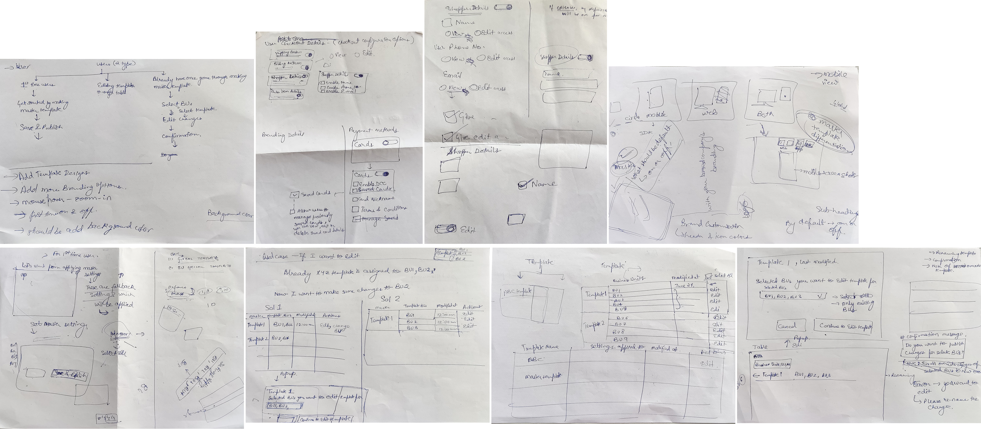
Iterations That Shaped the Final Design
Design Moments That Shaped My Thinking
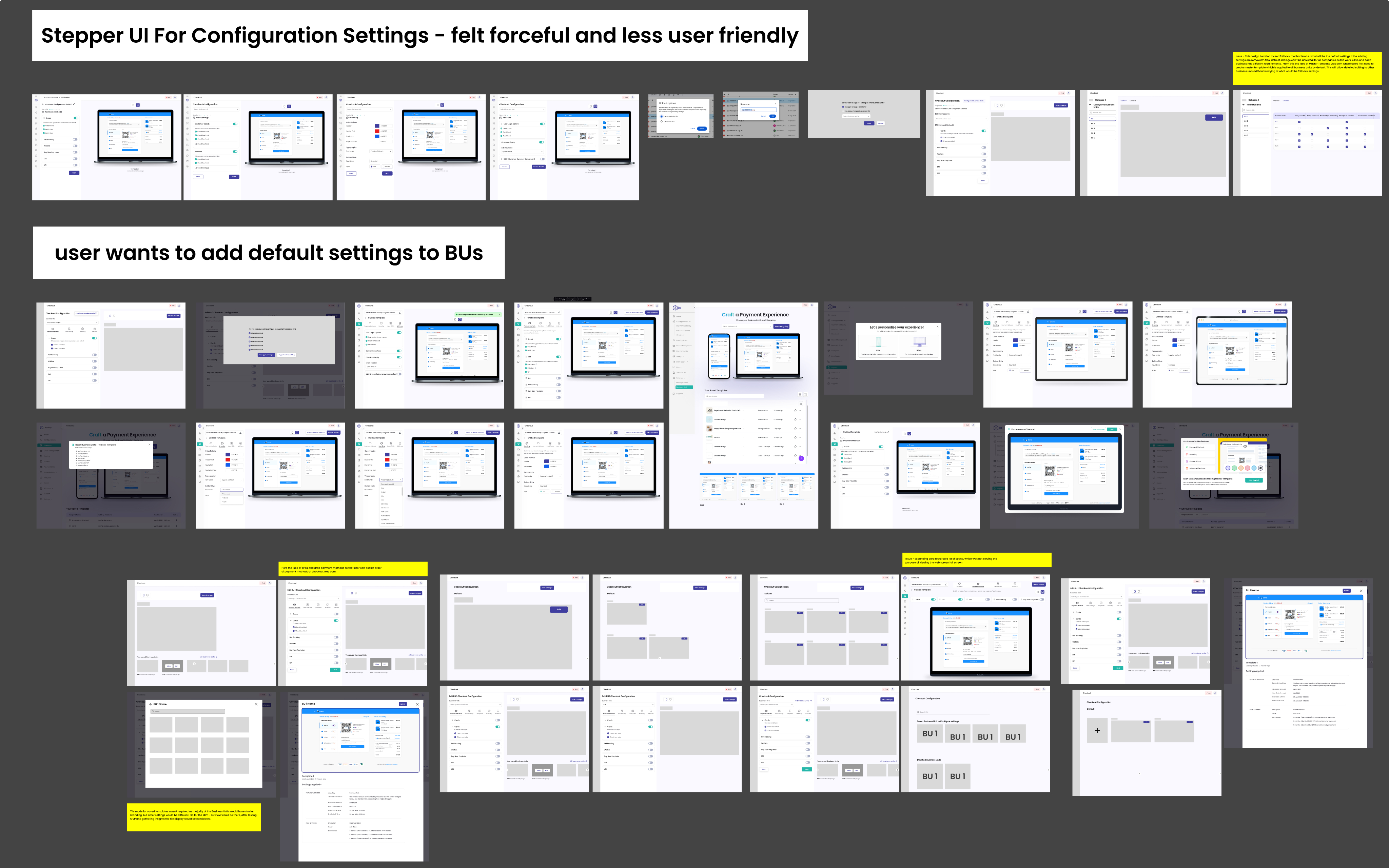
Why this iteration didn't work?
The design iteration lacked fallback settings,& a universal default wouldn’t work since each business has different needs. To solve this, I introduced Master Template that applies by default to all units, while still allowing detailed customization for each one.

Final Screen
An Idea was born here
Letting users reorder payment methods via drag-and-drop at checkout.

Final Screen
Why this iteration didn't work?
The horizontal expanding card layout consumed too much space and wasn’t scalable, limiting the full-screen web view.

Final Screen
Why this iteration didn't work?
At first, I considered a tile mode for saved templates. But since most Business Units shared similar branding & only differed in details, it wasn’t adding much value. For the MVP, I went with a list view and planned to explore tile mode later based on real user insights.

Final Screen
When Less Is More
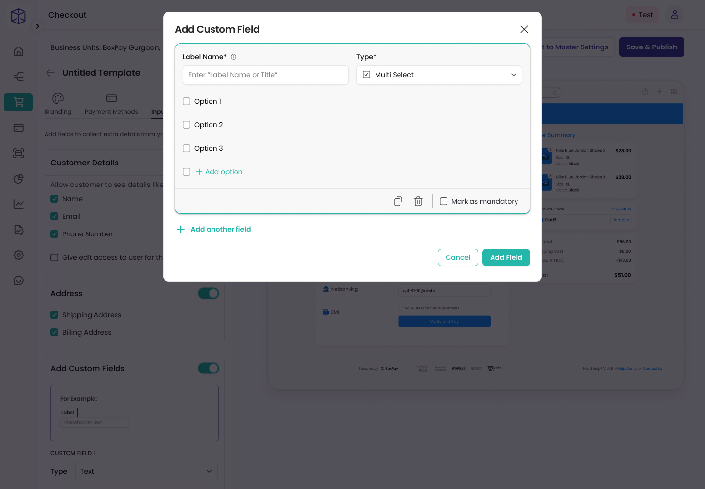
We often highlight the features we add, but this time I want to share how I removed one. During user testing, we found that offering custom fields wasn’t necessary in 99% of cases. After careful discussions with the manager, we decided to remove it.
Adding features is good - but adding the right ones is what matters for an MVP. Too many options can dilute user focus. The goal is to prioritize what’s essential and valuable.

Final Screen
Conclusion
Designing a product stems from passion and the drive to create the best possible experience. While offering a wide range of flexibility to users is important, it can also be overwhelming and time-consuming. For startups especially, it’s wise to begin with an MVP that can gradually scale through active user testing, customer feedback, and by observing real user behaviour.
As I write this case study, the design is progressing toward its V2 release. The V1 version- featuring essentials like payment methods and branding-has already been developed.


Home
No-code tool to design & launch payment experiences for every platform
Payment needs: Through the lens of Business' & Users
Payments are often the final hurdle in any purchase journey. Now, picture yourself as a user - after investing time and effort into finding the right product or service, you abandon the purchase simply because the payment experience feels clunky or untrustworthy. Even worse, imagine this happening to your own business - all your hard work in delivering a great service goes to waste due to a dull, disconnected checkout process that was never your core expertise to begin with. And the reality is, poor experiences tend to linger in people’s minds far longer than positive ones, whether online or offline. A checkout flow that feels disconnected from your brand can quickly drive customers away.
The Hidden Complexity Behind a Simple Need
At first glance, the need seemed simple- businesses wanted a payment experience that seamlessly matched their brand across platforms, displayed the right payment options for their users, and ultimately boosted conversions. The solution appeared obvious: build it for them. Initially, our approach was straightforward - merchants would share their design preferences and desired payment methods, and our developers would take care of the integration. This worked well in the beginning, before we had our no-code customization tool. Tweaking integrations frequently meant - multiple releases, involving high developers effort, longer turnaround time, eventually a pissed off merchant. As the number of merchants grew, it became clear that we needed a faster, more scalable, and simplified way to configure checkout experiences.
Note: When working in the B2B2C model, you've gotta be thinking simultaneously for two types of users - your client (merchants) & their clients (consumers). In short, I was designing a system that our users will use to design for their end users.
A visual teaser for clear product overview
Create a Master Template, Guided Onboarding Tour for first time users to increase their usability and discoverability curve
Setting Master Template allows business to modify it’s other Business entities with ease not worrying what will be the fallback settings for its sub-business units if settings are removed or if business wants to reset the checkout settings.
Businesses can define their preferred payment methods and customize the sequence in which they are displayed to users
Flexible branding controls let merchants customize colors, buttons, and brand elements for each business unit
After user has made Master Template, User Can Select Multiple Business Units for which user needs to Make checkout, make edits & access saved templates
Merchants can toggle between fields, preview designs in both mobile and web modes, and receive a confirmation prompt before publishing- ensuring they review checkout settings carefully before going live
Customer details, address, enable multi-language, checkout expiry, user login, DCC - Control all things payments
This is from where the design journey began.....
Iterations That Shaped the Final Design
Design Moments That Shaped My Thinking
Why this iteration didn't work?
The design iteration lacked fallback settings,& a universal default wouldn’t work since each business has different needs. To solve this, I introduced Master Template that applies by default to all units, while still allowing detailed customization for each one.
Final Screen
An Idea was born here
Letting users reorder payment methods via drag-and-drop at checkout.
Final Screen
Why this iteration didn't work?
The horizontal expanding card layout consumed too much space and wasn’t scalable, limiting the full-screen web view.
Final Screen
Why this iteration didn't work?
At first, I considered a tile mode for saved templates. But since most Business Units shared similar branding & only differed in details, it wasn’t adding much value. For the MVP, I went with a list view and planned to explore tile mode later based on real user insights.

Final Screen
When Less Is More
We often highlight the features we add, but this time I want to share how I removed one. During user testing, we found that offering custom fields wasn’t necessary in 99% of cases. After careful discussions with the manager, we decided to remove it.
Adding features is good - but adding the right ones is what matters for an MVP. Too many options can dilute user focus. The goal is to prioritize what’s essential and valuable.

Final Screen
Conclusion
Designing a product stems from passion and the drive to create the best possible experience. While offering a wide range of flexibility to users is important, it can also be overwhelming and time-consuming. For startups especially, it’s wise to begin with an MVP that can gradually scale through active user testing, customer feedback, and by observing real user behavior.
As I write this case study, the design is progressing toward its V2 release. The V1 version- featuring essentials like payment methods and branding-has already been developed.

Home
No-code tool to design & launch payment experiences for every platform
Payment needs: Through the lens of Business' & Users
Payments are often the final hurdle in any purchase journey. Now, picture yourself as a user - after investing time and effort into finding the right product or service, you abandon the purchase simply because the payment experience feels clunky or untrustworthy. Even worse, imagine this happening to your own business - all your hard work in delivering a great service goes to waste due to a dull, disconnected checkout process that was never your core expertise to begin with. And the reality is, poor experiences tend to linger in people’s minds far longer than positive ones, whether online or offline. A checkout flow that feels disconnected from your brand can quickly drive customers away.
The Hidden Complexity Behind a Simple Need
At first glance, the need seemed simple- businesses wanted a payment experience that seamlessly matched their brand across platforms, displayed the right payment options for their users, and ultimately boosted conversions. The solution appeared obvious: build it for them. Initially, our approach was straightforward - merchants would share their design preferences and desired payment methods, and our developers would take care of the integration. This worked well in the beginning, before we had our no-code customization tool. Tweaking integrations frequently meant - multiple releases, involving high developers effort, longer turnaround time, eventually a pissed off merchant. As the number of merchants grew, it became clear that we needed a faster, more scalable, and simplified way to configure checkout experiences.
Note: When working in the B2B2C model, you've gotta be thinking simultaneously for two types of users - your client (merchants) and their clients (consumers). In short, I was designing a system that our users will use to design for their end users.
A visual teaser for clear product overview
Create a Master Template, Guided Onboarding Tour for first time users to increase their usability and discoverability curve
Setting Master Template allows business to modify it’s other Business entities with ease not worrying what will be the fallback settings for its sub-business units if settings are removed or if business wants to reset the checkout settings.
Businesses can define their preferred payment methods and customize the sequence in which they are displayed to users
Flexible branding controls let merchants customize colors, buttons, and brand elements for each business unit
After user has made Master Template, User Can Select Multiple Business Units for which user needs to Make checkout, make edits & access saved templates
Merchants can toggle between fields, preview designs in both mobile and web modes, and receive a confirmation prompt before publishing- ensuring they review checkout settings carefully before going live
Customer details, address, enable multi-language, checkout expiry, user login, DCC - Control all things payments
This is from where the design journey began.....
Iterations That Shaped the Final Design
Design Moments That Shaped My Thinking
Why this iteration didn't work?
The design iteration lacked fallback settings,& a universal default wouldn’t work since each business has different needs. To solve this, I introduced Master Template that applies by default to all units, while still allowing detailed customization for each one.
Final Screen
An Idea was born here
Letting users reorder payment methods via drag-and-drop at checkout.
Final Screen
Why this iteration didn't work?
The horizontal expanding card layout consumed too much space and wasn’t scalable, limiting the full-screen web view.
Final Screen
Why this iteration didn't work?
At first, I considered a tile mode for saved templates. But since most Business Units shared similar branding & only differed in details, it wasn’t adding much value. For the MVP, I went with a list view and planned to explore tile mode later based on real user insights.
Final Screen
When Less Is More
We often highlight the features we add, but this time I want to share how I removed one. During user testing, we found that offering custom fields wasn’t necessary in 99% of cases. After careful discussions with the manager, we decided to remove it.
Adding features is good - but adding the right ones is what matters for an MVP. Too many options can dilute user focus. The goal is to prioritize what’s essential and valuable.

Final Screen
Conclusion
Designing a product stems from passion and the drive to create the best possible experience. While offering a wide range of flexibility to users is important, it can also be overwhelming and time-consuming. For startups especially, it’s wise to begin with an MVP that can gradually scale through active user testing, customer feedback, and by observing real user behaviour.
As I write this case study, the design is progressing toward its V2 release. The V1 version- featuring essentials like payment methods and branding-has already been developed.

Home
No-code tool to design & launch payment experiences for every platform
Payment needs: Through the lens of Business' & Users
Payments are often the final hurdle in any purchase journey. Now, picture yourself as a user - after investing time and effort into finding the right product or service, you abandon the purchase simply because the payment experience feels clunky or untrustworthy. Even worse, imagine this happening to your own business - all your hard work in delivering a great service goes to waste due to a dull, disconnected checkout process that was never your core expertise to begin with. And the reality is, poor experiences tend to linger in people’s minds far longer than positive ones, whether online or offline. A checkout flow that feels disconnected from your brand can quickly drive customers away.
The Hidden Complexity Behind a Simple Need
At first glance, the need seemed simple- businesses wanted a payment experience that seamlessly matched their brand across platforms, displayed the right payment options for their users, and ultimately boosted conversions. The solution appeared obvious: build it for them. Initially, our approach was straightforward - merchants would share their design preferences and desired payment methods, and our developers would take care of the integration. This worked well in the beginning, before we had our no-code customization tool. Tweaking integrations frequently meant - multiple releases, involving high developers effort, longer turnaround time, eventually a pissed off merchant. As the number of merchants grew, it became clear that we needed a faster, more scalable, and simplified way to configure checkout experiences.
Note: When working in the B2B2C model, you've gotta be thinking simultaneously for two types of users - your client (merchants) and their clients (consumers). In short, I was designing a system that our users will use to design for their end users.
A visual teaser for clear product overview
Create a Master Template, Guided Onboarding Tour for first time users to increase their usability and discoverability curve
Setting Master Template allows business to modify it’s other Business entities with ease not worrying what will be the fallback settings for its sub-business units if settings are removed or if business wants to reset the checkout settings.
Businesses can define their preferred payment methods and customize the sequence in which they are displayed to users
Flexible branding controls let merchants customize colors, buttons, and brand elements for each business unit
After user has made Master Template, User Can Select Multiple Business Units for which user needs to Make checkout, make edits & access saved templates
Merchants can toggle between fields, preview designs in both mobile and web modes, and receive a confirmation prompt before publishing- ensuring they review checkout settings carefully before going live
Customer details, address, enable multi-language, checkout expiry, user login, DCC - Control all things payments
This is from where the design journey began.....
Iterations That Shaped the Final Design
Design Moments That Shaped My Thinking
Why this iteration didn't work?
The design iteration lacked fallback settings,& a universal default wouldn’t work since each business has different needs. To solve this, I introduced Master Template that applies by default to all units, while still allowing detailed customization for each one.

Final Screen
An Idea was born here
Letting users reorder payment methods via drag-and-drop at checkout.

Final Screen
Why this iteration didn't work?
The horizontal expanding card layout consumed too much space and wasn’t scalable, limiting the full-screen web view.

Final Screen
Why this iteration didn't work?
At first, I considered a tile mode for saved templates. But since most Business Units shared similar branding & only differed in details, it wasn’t adding much value. For the MVP, I went with a list view and planned to explore tile mode later based on real user insights.
Final Screen
When Less Is More
We often highlight the features we add, but this time I want to share how I removed one. During user testing, we found that offering custom fields wasn’t necessary in 99% of cases. After careful discussions with the manager, we decided to remove it.
Adding features is good - but adding the right ones is what matters for an MVP. Too many options can dilute user focus. The goal is to prioritize what’s essential and valuable.

Final Screen
Conclusion
Designing a product stems from passion and the drive to create the best possible experience. While offering a wide range of flexibility to users is important, it can also be overwhelming and time-consuming. For startups especially, it’s wise to begin with an MVP that can gradually scale through active user testing, customer feedback, and by observing real user behaviour.
As I write this case study, the design is progressing toward its V2 release. The V1 version- featuring essentials like payment methods and branding-has already been developed.
Home
No-code tool to design & launch payment experiences for every platform
Payment needs: Through the lens of Business' & Users
Payments are often the final hurdle in any purchase journey. Now, picture yourself as a user - after investing time and effort into finding the right product or service, you abandon the purchase simply because the payment experience feels clunky or untrustworthy. Even worse, imagine this happening to your own business - all your hard work in delivering a great service goes to waste due to a dull, disconnected checkout process that was never your core expertise to begin with. And the reality is, poor experiences tend to linger in people’s minds far longer than positive ones, whether online or offline. A checkout flow that feels disconnected from your brand can quickly drive customers away.
The Hidden Complexity Behind a Simple Need
At first glance, the need seemed simple- businesses wanted a payment experience that seamlessly matched their brand across platforms, displayed the right payment options for their users, and ultimately boosted conversions. The solution appeared obvious: build it for them. Initially, our approach was straightforward - merchants would share their design preferences and desired payment methods, and our developers would take care of the integration. This worked well in the beginning, before we had our no-code customization tool. Tweaking integrations frequently meant - multiple releases, involving high developers effort, longer turnaround time, eventually a pissed off merchant. As the number of merchants grew, it became clear that we needed a faster, more scalable, and simplified way to configure checkout experiences.
Note: When working in the B2B2C model, you've gotta be thinking simultaneously for two types of users - your client (merchants) and their clients (consumers). In short, I was designing a system that our users will use to design for their end users.
A visual teaser for clear product overview
Create a Master Template, Guided Onboarding Tour for first time users to increase their usability and discoverability curve
Setting Master Template allows business to modify it’s other Business entities with ease not worrying what will be the fallback settings for its sub-business units if settings are removed or if business wants to reset the checkout settings.
Businesses can define their preferred payment methods and customize the sequence in which they are displayed to users
Flexible branding controls let merchants customize colors, buttons, and brand elements for each business unit
After user has made Master Template, User Can Select Multiple Business Units for which user needs to Make checkout, make edits & access saved templates
Merchants can toggle between fields, preview designs in both mobile and web modes, and receive a confirmation prompt before publishing- ensuring they review checkout settings carefully before going live
Customer details, address, enable multi-language, checkout expiry, user login, DCC - Control all things payments
This is from where the design journey began.....
Iterations That Shaped the Final Design
Design Moments That Shaped My Thinking
Why this iteration didn't work?
The design iteration lacked fallback settings,& a universal default wouldn’t work since each business has different needs. To solve this, I introduced Master Template that applies by default to all units, while still allowing detailed customization for each one.
Final Screen
An Idea was born here
Letting users reorder payment methods via drag-and-drop at checkout.
Final Screen
Why this iteration didn't work?
The horizontal expanding card layout consumed too much space and wasn’t scalable, limiting the full-screen web view.
Final Screen
Why this iteration didn't work?
At first, I considered a tile mode for saved templates. But since most Business Units shared similar branding & only differed in details, it wasn’t adding much value. For the MVP, I went with a list view and planned to explore tile mode later based on real user insights.
Final Screen
When Less Is More
We often highlight the features we add, but this time I want to share how I removed one. During user testing, we found that offering custom fields wasn’t necessary in 99% of cases. After careful discussions with the manager, we decided to remove it.
Adding features is good - but adding the right ones is what matters for an MVP. Too many options can dilute user focus. The goal is to prioritize what’s essential and valuable.
Final Screen
Conclusion
Designing a product stems from passion and the drive to create the best possible experience. While offering a wide range of flexibility to users is important, it can also be overwhelming and time-consuming. For startups especially, it’s wise to begin with an MVP that can gradually scale through active user testing, customer feedback, and by observing real user behaviour.
As I write this case study, the design is progressing toward its V2 release. The V1 version- featuring essentials like payment methods and branding-has already been developed.